
Week 5
Name all the layout elements?
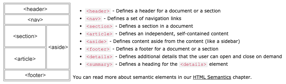
CSS layout techniques
What is a CSS framework?
This is a set of CSS styles that can be used to style elements or sets of elements
bootstrap is a good example
What is float?
float: left;
// elements floats to the left
float: right;
// element floats to the right
float: none;
// element doesnt float
float: inherit;
// inherits parent elements floating value
What is Flexbox?
What is a flex container?
This is a element that contains all the elements that you want to work with
set it to [below] first
display: flex;
what are the flex container properties?
flex-direction
flex-direction: column;
// arranges elements into a column, the first element declaired first
flex-direction: column-reverse;
// arranges elements into a column, the first element declaired last
flex-direction: row;
// arranges elements into a row, first element declaired first
flex-direction: row-reverse;
// arranges elements into a row, first element declaired last
flex-wrap
flex-wrap: wrap;
// elements will go onto the next line if no room
flex-wrap: nowrap;
// elements will not go onto the next line if no room
flex-wrap: wrap-reverse;
// elements will go onto te next line if no room and will
// be in reverse
flex-flow
this is short hand for flex-direction and flex-wrap
// syntax is as follows, and can be assumed for all combernations
flex-flow: row nowrap;
justify-content
justify-content: center;
// elements are grouped to the center
justify-content: flex-start;
// elements are grouped to the left
justify-content: flex-end;
// elements are grouped to the right
justify-content: space-around;
// appears that elements have equal margins
justify-content: space-between;
// elements on the far right and left will be up agains
// the side of the DOM, all elements are evenly spead
align-items
align-items: center;
// elements are grouped into the center y-axis
align-items: flex-start;
// elements are grouped at the top of container
align-items: flex-end;
// elements are grouped at the bottom of the container
align-items: stretch;
// elements are stretched to fill the container y-axis
align-items: baseline;
// elements will be centered along a baseline y-axis
align-content
align-content: space-between;
// all lines will have a equal gap on the y-axis, the first
// and last line will be pushed up against the parent
// elements boundrys
align-content: space-around;
// all lines seem to have a equal margin y-axis
align-content: stretch;
// all line elements will be stretched evenly along the y-axis
// so that the fill the parent element vertically
align-content: center;
// all lines will group to the center y-axis
align-content: flex-start;
// all lines will group at the top y-axis
align-content: flex-end;
// all lines will grop at the end y-axis
What is a flex item?
If a flex container is the parent element then the flex item is the child of that element
What are the flex items properties?
order
order: 1;
// this item will appear first
order: 3;
// this item will appear third

// the greater the number the later it comes
flex-grow
flex-grow: 3;
// this says the item will take up three units
// of space out of the total amount of units
flex-shrink
flex-shrink: 3;
// this says that this item wil shrink buy three units
// relative to everything else
flex-basis
flex-basis: 300px;
// this means that the max size of the element will be 300px
// and it will shrink relative to other items
flex
this is short hand for flex-grow,flex-shrink and flex-basis
flex: 0 1 200px;
// this means that
// flex grow is 0
// flex shrink is 1
// flex basis is 200px
align-self
// purpose is to override the align-items property
// set by the container

align-self: center;
// item is aligned to the center y-axis
align-self: flex-end;
// item is placed at the bottom of the container
align-self: flex-start;
// item is placed at the top of the container
What is grid layout?
This is where you use percentages to define the size of a item elsentually
just press this if you want to know more
Viewport
How do i set the inital zoom level and width of a webpage on a mobile device?
<meta name="viewport" content="width=device-width, initial-scale=1.0">
the code above says:
width=device-widthsets the width of the page the same as the device width
initial-scale=1.0sets the inital zoom level of the browser
What not to do?
- Do not used fixed size elements, since they cannot change to the viewport
- Do not rely on a particular viewport, test with loads of them
- Use media queries
Media Queries
What is a media query?
It uses the @media rule to test if a statement is true,
if the statment is true then the css rules will apply
What is a breakpoint?
This is where the current styling breaks down and begins to look not as intended
Is it good practice to design for mobile or desktop first?
mobile first
What would the media query be for a min screen width of 750px?
@media only screen and (min-width: 750px) {
//	styles here
}

// max-width can also be used
What would the media query be if the device is in landscape mode
@media only screen and (orientation: landscape) {
//	styles here
}

// portrait can also be used